Crafting Bento Grid Web Pages with AI Prompts
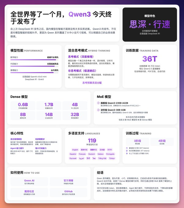
Design an Apple-Style Bento Grid Web Page with AI
This prompt template provides a comprehensive guide for leveraging AI to design modern, minimalist, and high-end product or service launch pages. Inspired by Apple's iconic design philosophy, the focus is on creating a compact, single-screen experience using the visually appealing Bento Grid layout. This approach ensures all critical information is presented succinctly and engagingly, ideal for showcasing new products or services.
Key Design Principles for Your AI Prompt:
1. Bento Grid Layout:
Instruct the AI to create a grid composed of various-sized cards. Each card should contain a specific category of information, ensuring the overall layout is tight yet uncrowded. This maximizes information density without sacrificing readability.
2. Card Design Specifications:
- Rounded Corners: All cards must feature prominent rounded corners (e.g., 20px border radius) for a soft, modern aesthetic.
- Background: Use a clean white or light grey background to maintain minimalism.
- Shadows: Apply subtle shadow effects to give cards a slight depth.
- Hover Effect: Implement a gentle 'float up' effect on hover to enhance interactivity.
3. Color Scheme:
Opt for a minimalist color palette, primarily leveraging white/light grey backgrounds. Integrate gradient colors as accent hues, for instance, a smooth transition from light purple (#C084FC) to deep purple (#7E22CE) to highlight key elements.
4. Typography and Hierarchy:
- Large, Bold Numbers/Titles: Use gradient colors to emphasize key data points and main titles, drawing immediate attention.
- Medium-Sized Titles: For card titles, ensure they are clear and concisely indicate the content category.
- Small Text: Use grey for supportive descriptive text, ensuring it complements the main content without overwhelming it.
5. Content Organization within the Grid:
Structure the content logically across the grid rows:
- Top Row: For major announcements, product features, performance metrics, or primary selling points.
- Middle Row: Dedicated to product specifications, technical details, and core functionalities.
- Bottom Row: Include usage guidelines and a clear conclusion or call to action.
6. Visual Elements:
Enhance the visual appeal and information delivery with:
- Simple Icons: Represent various features clearly.
- Progress Bars/Charts: Display comparative data effectively.
- Visual Rhythm: Utilize the grid and card layout to create an appealing visual flow.
- Tags: Present categorization information in small, capsule-shaped tags.
7. Responsive Design:
Crucially, the generated page must adapt seamlessly to different screen sizes, maintaining excellent readability and visual integrity on mobile devices.
Apple-Style Reference Points:
- The overall design should mimic Apple's official product specification pages.
- Emphasize ample white space and clean visual elements.
- Prioritize numbers and key characteristics, minimizing verbose text.
- Utilize gradient colors to highlight important data.
- Maintain appropriate spacing between cards for clear visual separation.
This detailed prompt empowers AI models to generate sophisticated and user-friendly web interfaces, blending aesthetic appeal with functional clarity, perfect for impactful product launches.